Key takeaways:
- Loading indicators are crucial for maintaining user engagement during content loading.
- Implementing skeleton screens can significantly reduce perceived wait times.
- Optimizing loading indicators enhances overall mobile user experience and conversion rates.
Understanding the role of loading indicators in mobile UX.
Modern mobile apps must deliver seamless, responsive experiences to meet user expectations. Users are quick to abandon slow or unresponsive applications. Incorporating a loading indicator into your app interface reassures users during content loading, signaling that their request is being processed. This subtle but crucial feedback helps reduce anxiety, encourages patience, and keeps users engaged with the application.
Loading indicators do more than communicate activity. They also serve as a psychological cushion, creating a sense of progress even during unavoidable delays. When thoughtfully designed, these cues can enhance user trust in your app, helping prevent abandonment and negative reviews that often result from uncertainty or perceived app sluggishness.
While most users expect some delay when loading complex data or media-heavy content, the absence of a loading indicator can be confusing and frustrating. Applying visually attractive yet functional loaders not only sets clear expectations but can also serve as a subtle branding element, making the user’s journey smoother and more enjoyable.
Responsiveness and clarity during wait times are critical for retention. Leveraging purposeful loading indicators can turn a potential pain point into an opportunity to reinforce your brand’s reliability and attentiveness.
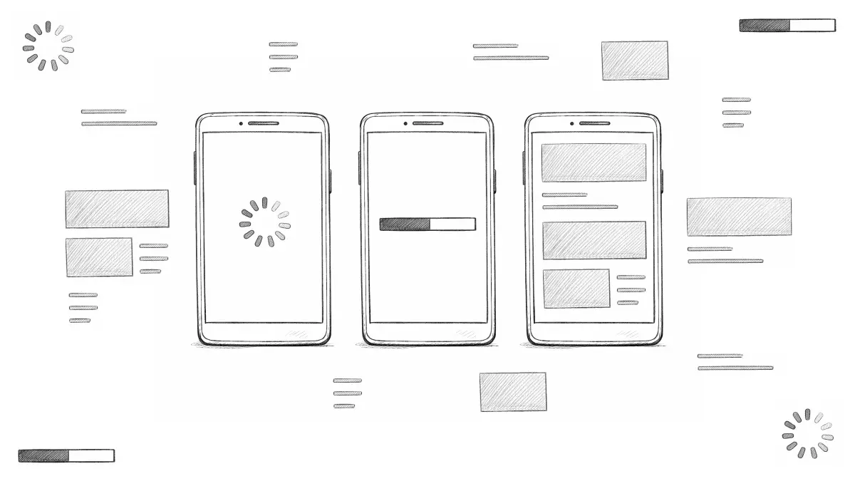
Types of loading indicators.
Different types of loading indicators serve various use cases within mobile apps. Choosing the right indicator for the right task ensures users are appropriately informed and engaged during different loading scenarios:
- Spinners: Circular animations that signal an ongoing process or a general app activity.
- Progress Bars: Linear bars depicting the percentage of a task completed, providing users with a clear timeline.
- Skeleton Screens: Placeholder layouts that visually map out what the loaded content will look like, reducing uncertainty and making the wait seem shorter.
For further insights into mobile UX trends, readers can consult resources such as this Smashing Magazine article on implementing skeleton screens in React, which explains the psychological effects and best practices for implementation.
Implementing skeleton screens for enhanced perceived performance.
Skeleton screens have quickly become popular as a way to reduce perceived wait times. Instead of showing blank or static loaders, skeleton screens display simple, gray placeholders that reflect the structure of the content being fetched. This approach provides a visual preview of what will soon appear on the screen, which most users find faster and less frustrating. For example, major platforms like Facebook use skeleton screens to display familiar layouts while fetching content, which helps keep users oriented and engaged.
Research shows that users perceive apps with skeleton screens as significantly faster and more polished than those with traditional spinners or static loaders. Implementing skeleton screens can be straightforward with libraries tailored to iOS and Android, allowing developers to customize the placeholders to match brand colors and UI elements. By making the wait feel shorter and aligning user expectations, skeleton screens contribute to higher retention and satisfaction rates.
Best practices for designing loading indicators.
To ensure that loading indicators enhance rather than hinder the user experience, adhere to these key design best practices:
- Consistency: Use uniform indicators throughout your application. This helps users recognize feedback patterns and reduces cognitive load when navigating between features.
- Visibility: Ensure loading indicators are easily visible across different backgrounds. Avoid overly subtle colors or animations that blend into the interface, as users may not recognize them as activity signals.
- Feedback: Whenever possible, pair loading animations with brief status messages that clarify what is being loaded or how much time remains. This can range from “Loading more posts” to a percentage counter for larger downloads.
Following these guidelines ensures users are neither overwhelmed by distracting animations nor left in the dark about what the app is doing behind the scenes. For more examples and guidance, check out this in-depth guide on animated progress indicators by Smashing Magazine.
Balancing aesthetics and functionality.
The balance between beauty and performance is pivotal in UI design. Loading indicators should enhance user engagement without introducing excessive complexity. Overly intricate animations can inadvertently extend load times, directly contradicting their intended purpose. Aim for lightweight, minimalist motion that reflects your brand personality without hindering functionality. Testing different designs in real-world scenarios can help identify what works best for your app’s audience, ensuring an optimal mix of form and function.
Measuring the impact of loading indicators on user engagement.
To evaluate whether your loading indicators are delivering positive results, track user engagement metrics such as bounce rates, average session length, and direct user feedback. Analyze changes before and after indicator enhancements to measure real impact. Decreases in bounce rates and increases in session durations are strong signs of improved usability and satisfaction. Gathering qualitative feedback through app reviews or in-app surveys can also uncover nuanced insights into user perceptions and frustrations with loading experiences.
It’s vital to continually assess and iterate on your loading indicators as your application and user base evolve. This ongoing process ensures that your brand reputation and user retention remain strong over time.
Conclusion.
Loading indicators are more than just a visual cue; they are an essential component of an exceptional mobile user experience. Deploying well-crafted loading indicators, such as skeleton screens, and following best practices for clarity, consistency, and feedback will boost user engagement and trust. By continually monitoring the impact of your UI adjustments and evolving them in line with user needs, you can sustain high conversion rates and foster lasting loyalty.
Leave a Reply